ex. f

colour 1:

  • ambiguity: a milky tan colour with some pink
  • a calm colour
  • quite bright

colour 2:

  • a fresh feeling
  • productive and progressive mood
  • it feels healthy — be it diet wise or physical state wise
  • in context of this picture, it also feel healthy

colour 3:

  • powerful
  • in context of this picture, i can already imagine the spice

colour 4:

  • the colour by itself conveys a happy mood
  • the colour you will see on food packaging
  • sunny and sweet
  • in context of the picture, it is working well. makes me hungry, increases my appetite

colour 5:

  • a more sophisticated colour
  • brownish grey
  • a stable, grounding colour (i imagine it to be the colour you find on tables and floors often)

ex. e

Observe this:

  • The letters are all capitalised –> creates effect of screaming/ shouting letters.
  • Monotonous to read
  • Unexciting and uninteresting, evokes impatience
  • It is hard and tiring to read due to the empty fill + thick stroke weight. This makes it exhausting to read since the use of negative space is extremely uncomfortable. (my eyes hurt)
  • It has central alignment so it is hard to follow through while reading
  • Overall is uncomfortable to read.
  • Lacking in visual personality
  • Change the letters of body text to lowercase
  • Switch to left alignment to guide reader and follow natural flow of the eyes (from left to right)
  • Add a line break when the point changes, as paragraphs allow a better absorption of information
  • To emphasise the hierarchy (title vs body text), the text can be written without an outline and only fill.
  • Improve typeface communication by using a more typewriter font since the content is about typeface itself.
  • Improve visual personality by adding colour or a different font. Will add contrast and variety, instead of its current depressing look.
  • Readability can be improved by de-capitalising the letters in the body.
  • Make it more interesting by incorporating art elements and colours, giving it more meaning (like adding icons or graphics)
  • Experiment/ play more with the headlines 
  • Consider reducing the words and getting the main point across in a more artful manner, that utilises typography to get the message across, instead of using it for the sake of it

Assignment 3_

MUMMY I AM SCARED

Thought process:

  • I want to choose an area of interest first, then narrow it down and pick what to present about it.
  • I want the topic to be relevant, interesting and timeless. however, can infographics really be timeless?
  • Two significant aspects:
    • What to present
      • What is more important? If there are three different ways to present it, and I can only choose one way,
      • Can I imagine myself to be professionally accountable to this infographic? E.g. If I chose to do one on Paris, can I be a tour guide and still proudly present this?
      • Possible ideas: the benefits of ____, different types of ____, how to prevent___, how to begin___
      • I like literature ~~
  • How do I present the information?

My take:

  • Always interested in Egyptian mummies
  • Curious about it
  • Wanted to use infographic to intrigue the audience and allow them to understand the culture of mummification as well
  • due to the limited space I wanted to provide a summarised version of all the research that I have come across
  • originally I wanted this to be a horizontal piece because I thought it would look more versatile but the final result was vertical because I wanted it to look more organised and for the information to be better relayed
  • the colours are gold, because i am inspired by the mummy ride in USS
  • i was also inspired by the plant VS zombie font, seen in the title
  • it was important for this piece to be satisfying to me
  • ensured lennings etc. are clear
  • readability was important so i aligned it constantly to the left, since an infraphic should be easy to read
  • i avoided strong colours like red, unless it is to highlight a point unintrusively
  • i skirted around the same quadrant of colour wheel –> warm earthy tones
  • i included green, yellow and orange in the center as a way to use colour to my advantage, in terms of conveying the information i was trying to propose
  • i wanted the bodies to be parallel almost, so the process from step 1 to 5 looks linear.
  • Challenges:
    • to make the mummy look presentable –> not overly creepy
    • to standardise the font size throughout
    • to find the right font for the title
    • to balance information and aesthetics (tho i know in lect, it was emphasised that information was of key/ more important)
  • One thing I learned was that layout was very important I have to have a clearly out in order for the audience to follow this sort process that I aimed to present
  • another important thing that I learned was the fact that fonts and colours makes a huge difference. For instance are used Sandy already tones because I wanted to emulate the same colours of the desert and that has really helped me convey my point. By simply using the triangle with the colours of a pyramid I managed to make it look like in abstracted version of a pyramid. That is really interesting to me because I manage to see how the concept of symbols and colours that we have learned in lectures come to life

How work has improved since critiuqe

  • changed orientation from horiz to vert
  • made my words stand out better
  • utilised better fonts for the title
  • clearly cut the sections of the infographic so information was easy to absorb, instead of being all over the place
  • took in the advice of not using stroke lines
  • i also reshaped the human body to a more egyptian style, because the original silhouette was too modern looking
  • i added more details to the pyramid
  • i changed the background base colour to a colour that gives more contrast
  • i added details with egyptian patterns to make it more aesthetically pleasing
  • i refined details, like the mummy’s drapes in the wrapped linen
  • some icons were traced by myself, such as the hand (i took my own picture of my hand and used my imagination/ common sense to draw the wraps)
  • i used image trace for more complicated items like the patterns, and used “option + drag” to increase my efficiency
  • i found that it was easier to copy and paste an image, and work on it independently (e.g. tracing on it), beyond the A4 limitations and edit it, and began doing that, in contrast to my previous Adobe assignments
  • i definitely got better and smoother in Adobe

Assignment2_

DOOR I SAY HI?

Thought process:

  • I want to make this story ‘me’, because I really enjoy social media and content creation.
  • How do I create a story with only 6-9 slides?
  • How can I tell the story in an impactful way?
  • Hm, I want to make it relatable with a splash of my originality to it
  • I then got reminded of my neighbour, Poom, and I’s frequent interactions. Her room is between my room and the toilet (which I frequent). As she opens her door when she is inside, I always make look into her room (like an annoying intrusive neighbour), but then by the time she notices me, I would have to stop and backstep to say hello. Thus, our interaction is really just, eye contact, a lot of the times. I got reminded of the beginning, before we got closer. I didn’t know if I should say hi, or if I was overthinking this whole thing. At some point, I thought she was unfriendly because we just never greeted each other during these fleeting interactions. However, after more than a semester, I begin to grow fond of this amusing little interaction. Hence, this story is quite a personal experience for me.
  • With that, I aimed to share the internal conflict of mine, and portray an awkward girl deep down.

My take:

  • I wanted this to be dramatic, and did so with the help of temporal concepts. First, 1-3 is a linear pace. However, I slowed down time from slide 5-8, in a sense that every micro-expression was close-read and stark. Then, I sped time up in 9 (elaborated more later).
  • The time in which I took this was at night, because practically, we are only both in hall at night, and also, to align with my own experience as closely as it can be.
  • 1-3:
    • I want to show the process of going out of my room, and into the corridor.
    • It helps with tension buildup
    • This helps with the storyline, as it is part of the core experience that the story is aiming to communicate
    • They are on eye-level, to convey a normal and comfortable everyday scenario
  • 4-5:
    • I needed to capture Poom’s candidness in 4. This meant she is just doing her daily chores without noticing me. The flash enabled me to capture the blurred motion of her hoodie in her hands, showing the directions of her natural movements.
    • But in 5, it was crucial for her to look up, as that is the trigger to my inner conflict that will unfold later.
    • In 5, her expression was spot on. This was out of my control and I need to thank her for being the best model for this. Her eyes are questioning, almost giving a ‘what are you doing here?’ or ‘what’re you lookin’ at!’ kind of energy.
    • I aimed for the two shots to contain the same properties (the shelf, table etc.) and only for her expression to be different. However, it is more zoomed in, in 5, to be more dramatic.
  • 5-6:
    • The layout is slightly adjusted to have slanted paralleled lines against each other. I wanted to add a ‘VS’ atmosphere. Of course this ‘tension’ is only in my head, because I am a little delusional due to my overthinking (in this story ^u^)
    • I took my own picture in 6, from a lower angle to display my socially awkward, and slightly incredulous expression (which just makes me more awkward.)
  • 7-9:
    • From an almost slow-motion of fist clenching (7-8) to a fast dash (9), the speed up in pace portrays the drama in the whole situation
    • In 7, my eyes exert a little more force, and while looking uncertain, I seem to have decided on something. The camera angle has also elevated to eye level again, suggesting a change of mind.
    • In 8, my fists clenched, and it is meant to pose a question mark in your mind, as you think: what is she going to do? Punch her?
    • But then in 9, you realise, the fist is made to prepare the dash off. You go ‘ah! So that’s what the fist is for’, though no one necessarily clenches their fists before running, it serves as more of a comical effect.
  • A consistent perspective is needed. A sudden switch (from first to third person) may be confusing and impede on storytelling.
  • Always look at this story with clueless lens to improve the clarity
  • Sometimes in critique, comments made are from a belief that there should be a high impact in each square progressively. Whereas for other people, they may lean towards the belief that having a slow progression may add even more drama in the end. So it depends.
  • There are many ways to tell stories, i.e. not all stories have to entertain or invoke an emotion. Some of my tutorial mates had really simple stories and it still conveyed the point very clearly and interestingly.
  • It is really significant to get critique, because people can always offer a new perspective on my work that I have never thought of.
  • Camera angles can make a huge difference in storytelling, which is why it is important to ‘make it make sense’
  • I increased the resolution by retaking my neighbour’s shots
  • I removed the confusing perspective change in my crit2 submission, from 1 to 2, it is a jump.
  • I considered what Kai said about ‘keeping things simple’, and so I made do without all the slanted lines of the layout.
  • I also tried improving resolution overall by sending them as files on my telegram saved messages instead of photos.
  • I got reminded about content-aware fitting halfway through and increased my efficiency greatly
  • I used the direction selection tool a lot when doing slanted angles
  • Dropping files after making a rectangle with the ‘rectangle frame tool’ is really a blessing
  • Zooming in and out with option and my mouse, has made work easier!!

Assignment1_

—- MY CROISSANT —-

Thought process:

  • What should I choose? Ah! A pleasant croissant.
  • How do I abstract this? Okay, reminder, Kai emphasised in tutorial that abstraction is about reducing…so DON’T ADD!
  • Given that, I shouldn’t introduce more colours, but keep stripping it.
  • The pelican sample was a huge source of inspiration because it is well done.
  • Only 3 colours, so always remember to eye-drop the shade and THEN adjust the colour to the closest shade possible to the original photo.
  • Which shade of brown should be my original shade?

My take:

  • The brown I chose is the attempted average of all the shades of browns (not too dark, not too light)
  • I wanted to capture the glaze of the croissant (it was important to me)
  • During abstraction, I couldn’t decide if the glaze should remain. I shrunk it in size and complexity, but finally decided it was not necessary, because it was just the ‘cherry on top’ detail as a croissant can be unglazed.
  • I was questioning if I should abstract this croissant specifically into the brand’s signature, or turn it into a typical/ well-known/ iconic croissant.
    • In the end, I chose the latter option. This was also due to critique in class that made me realise it is better to make an icon representative of a croissant (my focus) than the brand itself (Bacha Coffee House).

self reflection:

  • Initially, it was difficult to use Illustrator, I wasn’t familiar with the functions. The process felt infinitely draggy, but I’m glad I was determined to try.
  • I really wanted to make a piece of art. Especially as my interest lies in artistic creation, I didn’t want this to be a let down to myself. However, this may have blindsided me initially as it steered me away from the focus of the assignment: abstraction.
  • My workflow can be improved by being more organised from the very start, instead of trying to organise when I’m done with 2 stages already.

comments from my peers:

  • My stage 5 resembled a beehive (hard to unsee…)
  • I could have stopped at stage 4 (don’t extract the colours out)
  • Some proportions were inconsistent (like the width of the croissant)
  • What people liked: my use of colours instead of using outlines, stage 1 is nice (he liked the details i think)
  • I refined the edges –> I tweaked my careless mistake of mistaking the proportions
  • Used the colour
  • The improvement in Stage 4 (below): I made it more abstract by adding in space between each element, so they are more disconnected
  • Making each ‘block/blob’ disconnected eased the fruition of the final result for me (stage 5)
  • The improvement in Stage 5 (below):
    • Instead of using the main colour, I narrowed it down to the original tan colour. The dark brown is technically the chocolate glaze, so it is an addition to the croissant.
    • As I am trying to achieve ultimate abstraction, the essence of the croissant is 2 things: Shape and Original Colour–constituting the bread (tan colour).
    • Hence, abstraction becomes 3D, akin to stripping away the physical layers of the bread.
    • Another reason for this colour is because it is more recognisable and relevant to the concept of a croissant. We are trying to create an icon!
  • Grouping (very useful for locking and shifting)
  • Pressing shift to make adjustments proportionate and fixed
  • The eraser function was useful, and i appreciated the pen tool as it allowed me to tweak/stretch the shape
  • I named certain layers/ objects when they are more important to me.
  • (Difficulties): Organising them was a hassle because everything was under pen tool
  • Screenshot of workspace is below

Thank you for reading! ❤

ex. d

Through this module(/course), we emphasise that meaning can be conveyed through photography.

Subject: reuben’s dog Pebbles

Eye level: titled ‘puppy eyes’ (duh!) –> direct connection with you. A soulful and yearning look.
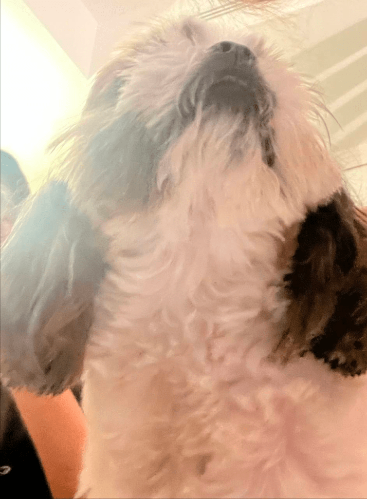
Low level: ‘Pray to me’, makes Pebbles look superior, mighty and towering. He is out to forage findings for the family.

Visual composition: He takes up the almost 90% of the whole screen. His presence is overwhelming, just like the exaggerated angle. I can hear his panting and imagine his saliva dripping onto me.
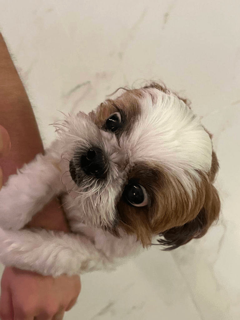
High level: ‘Pretty please’. Looks vulnerable and dainty (deceiving us to give it more treats).

Seizing the moment: The intensity of Pebbles’ gluttony is captured here. He is eyeing the treat. Also, this picture does not bring me peace…

Up close (and personal): This up close shot makes Pebbles look innocent and unassuming. It also evokes certain affections and you may feel like it is cute. (I also want to point out that this is a very common trend among GenZs these days on social media.)

However, despite being up close, it is blurry to signal that this photo was taken in the moment (not a static subject).

Bird Eye View: Almost unrecognisable, the angle really makes everything seem small and insignificant. I call this the omniscient angle.

Visual composition: Centre of the photo; it is clear that Pebbles is the subject. A lot of space that surrounds him is captured in the photo.

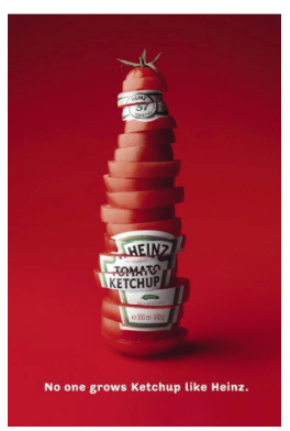
ex. c

Instructions

  • Review the print ad
  • Write about the sign — what is the signifier, and the signified. Essentially, analyse + describe what the ad is trying to say

Signifier: red colour background, chopped up tomatoes, stacked + text ‘no one grows Ketchup like Heinz’

Signified: Fresh and organic tomatoes. Heinz ketchup is outstanding because of how it is made.

ex. b

Instructions:

  • apply constructive criticism model in evaluating a design OR artwork
  • choose anything on the internet!
  • upload brief and succinct report on blog

This is a painting, in oil paint, titled ‘Godspeed’ by Edmund Leighton. It is known to the public in 1900, exhibited in the Royal Academy of Arts, Britain.

The main focus of the painting is the woman and the man. A ginger woman, wearing a patterned, cream gown perched on the front step, with her hands holding on to a red fabric that rests on the arm of an armoured knight. They are looking at each other. There is a banister separating them. There are flowers in the background on the woman’s side. On the knight’s side, there are smaller figures of other men ahead of him, dressed in the same attire as the knight in front.

The visual effect of this artwork displays a variety of mild colours (pastel yellow, light brown, green), bright colours (red, ginger, pink) and dark (deep brown, grey).

The texture of this painting is luminescent due to its medium being used (oil paint). For the colours used, there is a contrast between light and dark, intense and mild, allowing to painting to be very striking to both a trained and untrained eye.

The proportion of people and the architecture is very drawn to scale, allowing this painting to be realistic.

The woman is tying the red fabric on his arm. The man is likely her lover, due to their close proximity and intense eye contact. The man is going to war or battle, and they are bidding each other goodbye, correlating to the title ‘Godspeed’.

The artist is trying to show a farewell between two lovers. The smaller men ahead in the background signals that the knight is is lagging behind, as there are no soldiers beside him.

The colour red communicates intensity and passion, foreshadowing the values that a soldier must have in order to fight for war. The pastel creamy white is a colour that signifies purity.

(reminder to self: my personal evaluation based on my understanding of the work)

This artwork communicates the themes of duty and love. Subthemes can include yearning (for each other), risk (of never seeing each other again due to the brutal reality of war), loyalty (to each other, but also to the country) and law (the obligation to obey it). It is clear that the knight has chosen duty and loyalty to the country, expressing the painful reality of so many couples that part in light of war.

This is a timeless artwork, because even today, war is still waging.

Shortcomings –> really hard to find….. what’s lacking? i think im afraid to sound unrefined in my judgement and end up sounding like some aunty on stomp ..

But to really put the poison out there, I think the facial expressions should be captured more aptly. For now, I can only see the side profile. The man doesn’t even show any emotion, he looks apathetic. I can barely see the woman’s face too. It would be more emotion-provoking if there is a sliver of emotion.

Side note: maybe there are perhaps reasons as to why this is so, like a poker face reflects how the man tries to keep his emotions in, or maybe this artwork intends the audience to interpret however they want. But that’s just my balance argument. hehe

ex. a

my creativity-enhancing device

Disclaimer: my perceptions and ideas may change overtime, so pardon certain underdeveloped thoughts

Am told to sketch a machine/ device that may enhance my creativity.

Prompt: things that make me ‘tick’ (inspire me)…

  • Plays/ dramas/ movies with a powerful and/or thought-provoking message
  • Spoken poetry
  • Being in a crowd that knows the music and sings it with conviction
  • Any ephemeral experience, really
  • Emotional art forms (singing, dancing etc.)
  • Someone passionately talking about something
  • Watching the world cup

Has this been helpful?
Yes, because I realise I gain inspiration from collectivity, the human experience and powerful emotions.

First, I would like to define creativity–wrong, we shall not define it.

Once defined, or subjected to a comprehensive list, there are already precious things/ ideas lost in that process. For instance, defining creativity as ‘free’ could subject it to not be ‘restrictive’, which, if I may, rob certain aspects of ‘what could have been’.

Used to being in a system, an organised society; statistical limitations plague my life, and very possibly hinder creativity.

Hence, we shall not put things in a box. But we also can. Because we are, like, creative//////\\\\\\\\\\

And therefore, I decided to create my device as a reminder for myself to never develop a tunnel vision, that my thoughts and ideas can exist on multiple planes and dimensions, and it is okay if it’s ‘too chim’ or ‘sounds like bullsh*t’. Because we are purely creating.
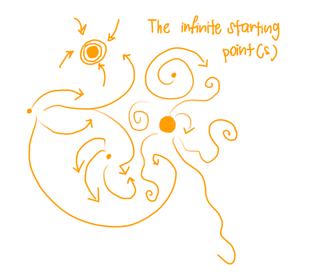
creativity-enhancing model

How it works (as symbolisms and reminders):

  • The small orange-filled circle on the left is a supposed starting point
  • But so are the other circles, they can exist anywhere, and some even vary in design and size — reminding me that I can begin anywhere and there isn’t a right/ linear way to it
  • Multiple starting points are also sometimes ending points
  • The arrows are supposed to represent the direction of my thoughts, ideas and feelings (three important things needed whilst creating)
  • Some arrows change the course of its direction, signifying the abruptness of novelty and inspiration
  • Some ‘arrows’ are simply lines, which signals that the means of gaining something in the process of creativity could be different from how I expect it to be (i.e. through an arrow format)

Overall, the sketch of this ‘device’ is meant to be creative and elusive in itself, because in creativity, we don’t need to be all that straightforward. This device is largely metaphorical and meant to be thought-provoking.

To me, not having a focus in creation is sometimes a creation in itself too. But clearly, having a focus doesn’t render the creation any ‘less worthy’ too.

So, this device helps to reduce the tendency for certainty or rigid structure while I am creating, probably enhancing my creativity in that process.

🙂

Thanks for reading, hope you enjoyed! – Mizuki